Wednesday, March 15, 2017

PROJECT 5.1: VALUE (part 1)

Value is actually a very simple concept at the outset. It is, plainly put, the lightness or darkness of a color. However, there is such a range of lightness and darkness that can be achieved, in addition to how it is put to use within a composition, that value can be very complex in practice. The importance of value is in its ability to express either strong contrast or subtle gradation in a composition, thereby circulating the attention of the viewer's eye by emphasizing some things and de-emphasizing others. This is yet another example of our ongoing conversation concerning the creation of a compositional door that allows the viewer to enter a work, and then to move about within it based on an implicit or explicit compositional scheme. Value is yet another means to assist this process.

But let's start simply. The most basic expression of value comes in the form of what is called a
grey scale. The grey scale starts with white and, by moving to black, expresses a range of greys in between. There are, in fact, hundreds of possible value steps in between white and black that the human eye can perceive, but for the purposes of our value exercise, we will only need to identify ten.

For the first part of project #5, you will need to create a grey scale, expressing a move from pure white to pure black in 10 steps. First, you will draw out lightly in pencil a one by
ten inch strip on your bristol card. Then, you need to mark off each of the ten inches, so that you will end up with ten one by one inch squares on this strip. The first square will be painted in with pure white acrylic. The last square will be painted in with pure black. You will then need to, in the remaining eight squares, begin to slowly add a little black to white to gradually move from white to black. You must not create any sudden jumps, as this needs to be a very gradual process. What you are looking for, are half-steps, that is a value that appears to exist halfway between the value before it and after it. It needn't be a smooth transition, but a logical halfway point. You will most likely have to spend numerous maddening attempts at arriving at the correct mixture, making multiple passes at a single step. In this way, you will probably need to cut each square out and add or subtract them as you try to finalize a graduated scale.

You must get my approval
before you arrive at a finalized scale, so that we can determine that there is indeed a recognizable but subtle change from one step to the next. Your greyscale must demonstrate: proper and complete mixing, without any streaks of white or black, a smooth application of paint without excessive brushstrokes and heavy paint, and the correct size for each step-- one by one inch squared, cut evenly (anything smaller than this, or cut crookedly, will not be accepted). Once you have your total 10 steps, you should number the backs of them from 1 to 10 so you may keep track of their sequence. Here is an example of an nine-step grey
scale:


Your grey scale should be well underway by the end of class, on Thursday March 16.

After your grey scale is complete, you will begin the second part of your project.

Wednesday, March 1, 2017

PROJECT 4: TEXTURE


What is texture? With texture, we are dealing with the concept of surface characteristics. Is the surface smooth, rough, soft, hard, patterned or plain? When approaching texture in design as a visual element, we must first classify it into two categories: 1. Visual Texture and 2. Tactile Texture.

Visual Texture
. Visual texture, although two-dimensional, has the ability to convey a
sense of surface. Seen by the eye only, it can convey the illusion of tactility. It is a flat interpretation of that which can be touched.

Tactile Texture
. When we speak of tactile texture, we are identifying texture that has dimension.
Something you can touch, not just see. You can run your hands over it to feel the varying degrees in surface changes. It is not flat.

Within these categories, there are still further distinctions to be made: 1. decorative texture, and 2. structural texture.

Decorative texture is something that can exist independently from a form, meaning it exists only on the surface like a skin or a coating. You could peel it up or lift it off, and the form beneath would remain unaffected. In this sense, decorative texture has a flatness and uniformity to it. Think of it as wallpaper, gift wrap, or a shirt with a printed pattern. You may wear a shirt with texture in the form of patterned stripes, but what is on the shirt does not describe the structure of what is beneath it, namely you. However, if you were to look closer at the shirt, and see the texture of cotton fibers, for instance, then you would be noticing structural texture. For the pattern of the woven fibers is related to the very construction of the fabric of the shirt.

Just as in our exploration of line as being mechanical or organic, we can identify structural texture as mechanical or organic. Consider the organic texture of tree bark, or even a plank of wood-- the pattern of its fibers determined by the course of its growth, compared with the texture of that shirt mentioned above-- most likely the product of weaving by a machine, or even a human hand that guides the thread on a more rigid course.

In this class, although you may be using tactile texture as a source for study, you will not be creating it. That is, rather than creating dimensional texture that you can feel, you will only be implying texture in your project using visual texture.

PART 1: TACTILE TEXTURE ZINE


Locate and study at least six tactile textures that you can touch. They can be either six mechanical textures, six organic textures, or a mix of the two. The only requirement is that each of the three are completely different and in total contrast from one another. Think of wood, rock, fabric, skin, soil, smoke, liquid, paper, plastics, fur... the list goes on. You need to either take a photograph of the texture, or figure out a way to scan/xerox it.
After choosing/recording six textures, you then need to write about them. For each texture, make a list of adjectives describing their inherent properties. You must describe them, as if you were describing a texture than has never been seen or felt before. You cannot describe a piece of wood as being "like wood." Instead, you need to think about what makes wood "wood," as if you were telling another person who has never seen wood before.
Following this handy online guide:  
http://experimentwithnature.com/03-found/experiment-with-paper-how-to-make-a-one-page-zine/#.V-qye5MrLdQ 
... you are to make a folded, black and white zine, that presents your text and images, with a cover and a back cover of your design, with a title, your name... It is as if you are making a miniature book with a sequence of text and images. Each page should be divided in half (horizontally), so that your texture is on the top and your list of adjectives is on the bottom. Bring your completed booklet to class on Thursday, March 9. 

PART 2: VISUAL TEXTURE DRAWING

Using our zines, we will then abstract each of the textures by focusing on an area or a patch, and then making a line drawing of that area only in the form of a thumbnail on sketch or gridded paper so that you will end up with three thumbnails each containing a detail of the six textures. 
Then divide a sheet of 10 x 10 inch bristol card into a composition, adding and expanding upon multiplied views of your texture details. You can do this by sketching the textures out lightly in pencil, and then inking that in. In the end, you should have on your 10 x 10 inch bristol card, a composition of contrasting texture abstractions. What I mean by abstractions, is that since you are focusing only on the texture, we will not see what that texture belongs to in the end. One of the three bands may be the lines taken from a piece of bark, but there is no indication of it belonging to a tree. Just pure texture 
You will need to turn in your written descriptions, your thumbnails, and your 10 x 10 inch image of three texture abstractions.

DUE THURSDAY, MARCH 16.


Below, I have provided some examples of previous student responses to texture abstraction.


Frottage: Max Ernst / Richard Long

Frottage is a surrealist and ‘automatic’ method of creative production that involves creating a rubbing of a textured surface using a pencil or other drawing material. 

The technique was developed by Max Ernst in drawings made from 1925. Frottage is the French word for rubbing. Ernst was inspired by an ancient wooden floor where the grain of the planks had been accentuated by many years of scrubbing. The patterns of the graining suggested strange images to him. From 1925 he captured these by laying sheets of paper on the floor and then rubbing over them with a soft pencil. The results suggest mysterious forests peopled with bird-like creatures and Ernst published a collection of these drawings in 1926 titled "Histoire Naturelle" ("natural history").


He went on to use a wide range of textured surfaces and quickly adapted the technique to oil painting, calling it grattage (scraping). In grattage the canvas is prepared with a layer or more of paint then laid over the textured object which is then scraped over. In Ernst’s Forest and Dove the trees appear to have been created by scraping over the backbone of a fish.


Richard Long frottages:


DECALCOMANIA

Enrico Donati: Decalcomania (81) and (82) [diptych], oil and tempera on paper, 16 x 12 1/2 inches (each), 1944

Enrico Donati: Decalcomania #4 (Red), ink on paper, 15 1/2 x 13 1/2 inches, 1945

Enrico Donati: Decalcomania (60), oil tempera on paper, 9 1/2 x 13 1/2 inches, 1943

Enrico Donati: Decalcomania (54), Oil tempera on paper, 13 x 11 1/2 inches, 1944

Enrico Donati: Decalcomania #5, oil and tempera on paper, 13 x 17 inches , 1947

Enrico Donati: Untitled Decalcomania, flottage on paper, 11 3/4 x 9 3/4 inches, 1946

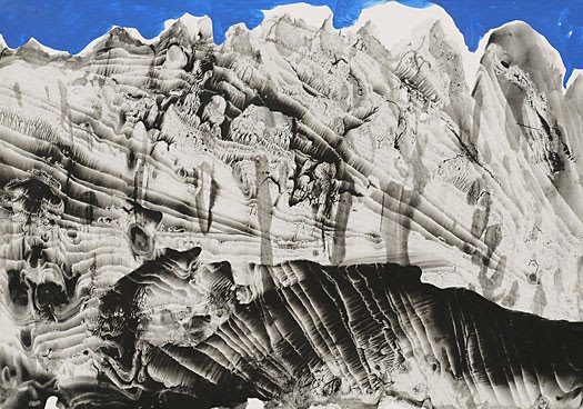
As a supplement to our discussion of texture, I'd like to direct your attention toward a painting/drawing technique that was perfected by the Surrealists, called decalcomania:


"..a perfected form of a well-known children’s game, the ‘blotting’ game. Here the method was to pour diluted black gouache on to a sheet of white paper of a certain texture, covering this with another sheet and then execising uneven pressure with the hands, in order to spread the gouache. The result, always unpredictable, is a highly contrasted composition in black, grey and white, in which one can discover landscapes, profiles or heads, composite animals, [or] unknown plant life. […]Max Ernst conceived the idea of trying the experiment directly on a canvas, with oil paint reduced to a suitably fluid state. What began as a mere game suddenly seemed to him to offer rich possibilities…" (Patrick Waldberg)

I've included some examples below of how this technique was used by the master of the technique, Surrealist Oscar Dominguez, for you to consider the possibilities of organic texture:


Wednesday, February 15, 2017

PROJECT 3: SHAPE / GRAPHIC SCORE

Let's flesh out, in it's entirety, a definition of shape, with the aid of some descriptions culled from Principles of Two-Dimensional Design, by Wucius Wong:


Let us first make a shape. Start with a single point (a). Then take about ten steps forward from that point and put down a second point. Connect those two points with a line (b). Let's start at each end of our line and, at the same time, drop down two more lines. Then, we connect those two lines with a fourth line (c). These four connected lines have now made something. Actually, we can look at it as a single line with a starting point and an ending point, that has moved in four different directions at each corner.This path of a line in motion is a plane. Unlike a line alone, it has length and breadth. However, it does not have thickness-- something we will be dealing with when we discuss space. For our immediate purposes, let's just focus on this thing called a plane. We can look at the plane seen above, and we can call it a shape. This shape happens to be a rectangle. Calling it a shape, and then identifying what kind of shape it is, is a means of describing what we perceive. The three visual elements that help us in this process of identification are: size-- all shapes can be compared with one another in terms of how large or how small they are; color-- we are able to perceive a shape separate from what surrounds it, through color, including the use of black, white and gray; and, as mentioned above, texture.

Now, the lines that form the edges of a plane or planar form, may have different characteristics that determine what kind of shape you will have. Based upon these different characteristics, the following is a listing of shape-types:

1) Geometric-- mathematically constructed.
2) Organic-- defined by free-flowing curves.
3) Rectilinear-- defined by straight lines not mathematically constructed.
4) Irregular-- defined by straight and curved lines not constructed mathematically.
5) Hand-drawn-- created by the hand without the aid of tools.
6) Accidental-- the specific result of a particular material in conjunction with chance.
Here are some examples (with matching numbers) courtesy of Mr. Wong:


It should also be noted, as some of you may have discovered in your previous projects, that planar forms/shapes can be suggested or implied with points and/or lines grouped together or arranged in rows, as well as by means of a simple outline.

Now that we have identified the six different types of shape, we can begin using shapes. 

Let's first lay the groundwork for where and how you will be using these shapes in a series of elementary relationships. Mentioned at the beginning of the semester, was the concept of the picture plane. The picture plane, just as in the concept of the plane discussed above, is determined by boundaries, and is a working area or zone for you. The picture plane exists within something called the framal reference, which is the outermost boundary of your design. Consider the framal reference the edges of your bristol board or illustration board. The picture plane is therefore the area or areas that can me marked off within the framal reference, for you to work within, and can be smaller than, or the same size as your framal reference.

It is within your picture plane that you will create shapes, and it is within the picture plane that you will determine how your shapes exist, using what are called the relational elements. These are elements that determine placement and how how shapes interact or relate with one another:

1) Direction-- Determined by how it relates to the viewer, to the frame it is within, or to shapes near it.
2) Position-- Determined by its relationship to the frame o
r the structure of the design.
3) Space-- As a rule, all shapes occupy space. Therefore, space is either occupied or not. it either contains shape, or it is empty. Space can be flat, as we will be dealing with in this project, or it can have depth by illusory means (as we will be dealing with later).
4) Gravity-- Gravity is something that is felt, not visualized. This is determined by a sense of lightness or heaviness, stability or instability associated with individual shapes or shapes existing in groups.

In your first two projects, you have already been dealing with the relational elements as we have approached viewing a work with thoughts or feelings concerning all four of the above issues. Now you need to bring a greater emphasis and focus on them when planning all of your subsequent projects.

And now for project # 3. Pay close attention to the guidelines, as there are many more conceptual, in addition to visual, issues to consider. 1) Create what we will call a shape index. On your sketchbook or gridded paper, you need to plan out at least five examples of each of the shape-types mentioned above. I recommend that you divide your paper up into six sections for each type, and sketch out all of the types that you can think of. Then carefully choose five from each section that you are satisfied with. Your selection process must be determined by whether or not your shape type adheres to the characteristics identified for each type. After you have chosen five shapes for each of the listed types, you will draw them lightly in pencil, grouped according to type, in six straight horizontal rows, on an 10 x 10 inch sheet of bristol card. Measure out six rows first, and then draw them in. After you have drawn them in, you will then take your smallest brush, and you will very carefully color each shape in with your black pen/marker. It should go without saying, that you need to keep your white areas clean and free of unnecessary marks. Here is a student example of a shape index:


2) After making your shape index, you will then return to your sketchbook or gridded paper, and, using your shape index, you will compose a graphic score. What is a graphic score? A graphic score is a means of composing music that does not use traditional notation. Meaning, instead of music notes resting on a five-line staff that represent individual sounds to play, there are shapes on a page with each shape representing a sound, to be interpreted by a performer. So, how are you going to go about making a composition? First, identify each shape with a sound. It does not have to be a musical sound. For instance, one shape could be a car horn, another could be clapping hands, and yet another could be a cough. Once you have identified each shape with a sound, written below the corresponding shape on your index, you may then set about composing a graphic score in which all of these shape/sounds are placed into relationship with one another so that when you read it back to yourself, not only can you see the shapes, but you can imagine a work of sound. Unlike your shape index, your graphic score should be utilizing your shapes with full consideration paid to the relational elements. This means that the position and direction of your shapes should all be changing. Consider the space between shapes, gravity, repetition-- many of the same shapes may be repeated. Consider also the size of the shape in relation to how loud or how soft the sound it represents may be. A shape may be very large in one part of your composition, and yet that same shape may be smaller somewhere else, based upon its  loudness.


NOTE: You may also incorporate point and line, in relation to your shapes, within your score.

So, after you have arrived at what should be a very complex reorganization of all of your shapes in the form of a graphic score, you will need to place that composition onto a sheet of 10 x 10 inches (or larger) bristol card. Again, lay the shapes out lightly in pencil, and then very carefully color them in using your black pen/marker. Here is an example of how the student who made the shape index shown above, created a graphic score using that same shape index:


And here is another student shape index + graphic score:


You may also consider the aid of a computer to plan your score, by generating shapes digitally and creating the composition as a large digital print. You may also create the shapes digitally, each at a different scale, print them out, and then using a lightbox, trace the shapes into a composition onto bristol board with pencil, to then carefully ink.

DUE THURSDAY, MARCH 2nd.

GENERATIVE MUSIC

From the website Generative Music:

"Trope, designed by ambient pioneer Brian Eno and musician / software designer Peter Chilvers, expands further on the ideas introduced by Bloom, their acclaimed iPhone application. Darker in tone, Trope immerses users in endlessly evolving soundscapes created by tracing abstract shapes onto the screen, varying the tone with each movement. Recommended for headphones and external speakers."

Trope, by Brian Eno and Peter Chilvers:


On "Scape":
Scape makes music that thinks for itself. From Brian Eno and Peter Chilvers, creators of Bloom, Scape is a new form of album which offers users deep access to its musical elements. These can be endlessly recombined to behave intelligently: reacting to each other, changing mood together, making new sonic spaces.

Can machines create original music? Scape is our answer to that question: it employs some of the sounds, processes and compositional rules that we have been using for many years and applies them in fresh combinations, to create new music. Scape makes music that thinks for itself.

- Brian Eno, Peter Chilvers


CORNELIUS CARDEW: TREATISE