Wednesday, March 15, 2017

PROJECT 5.2: VALUE (part 2)

For the second part of your value project, you will be required to apply the skill and knowledge that you have fostered during the creation of your 10-step greyscale.


Once you have successfully finished your 10-step greyscale, you will need to obtain a color reproduction of an "old master" painting-- the term "old master" typically refers to a European painter of skill who lived and worked from 1470 to 1800. This reproduction must only come from a book or a postcard (in other words it has been professionally printed) and not the internet. The reason for this, is that many digital reproductions incorrectly represent the original color balance and contrast of the works, as images are repeatedly sampled, re-sized, compressed and edited without the knowledge of the original copyright holders. I suggest that you locate at least three images of interest to you-- images that demonstrate a range of color and a dynamic composition. Additionally, your image cannot be a cropped detail of a full work, but must be the entire image. Pay attention so that you do not choose a cropped image.

You will need to bring these images with you into Thursday's class meeting, along with your completed grey scale. This means that you must bring the book or the postcard from which you will arrive at a final image to use. You cannot bring a computer printout or a copy from a Xerox machine. I will be speaking with each of you, one at a time, to discuss your image choice during class. If you do not have an image-- you will receive point deductions.


The Nightmare, by Henri Fuseli (1781)

View of Toledo, by El Greco (1596-1600)

After you have an image to work with, and receive the go-ahead from me, to create a very simplified line drawing of the work you have chosen, onto a sheet of illustration board (not bristol board) that is at least 10 inches wide. That means you need to include a one by ten inch strip at the bottom of your composition, where you will carefully glue your bristol board greyscale chips down into place-- neat and straight. Then, you are to look at the reproduction of the painting you have chosen, and match it's light and dark areas with the steps of light and dark in your greyscale. That is, consider each step a number (from 1 to 10), and when you match a value to the value in the source painting, you write that number on the corresponding area in the drawing on your illustration board. In other words-- you are making a paint-by-number value translation of an Old Master painting, in order to familiarize yourselves with the compositional uses of light and dark distribution. This exercise will help you see how areas of light and dark can be composed to masterfully guide a viewer through a work. By breaking the composition into shapes of light and dark, you are seeing a painting for its value and compositional makeup, rather than for its subject or "style."

Once you have determined all of the values, you will then need to paint your composition. Do not worry about blending or the need to "forge" a perfect copy of your source. If you do this right, it should actually look much more simplified than the original with stark, graphic shapes, rather than areas of blended subtlety. Look above for some student examples. I also suggest you mix a single value and then paint of of that value out, before moving onto a different value.

Mix your paint gingerly. Meaning-- take care to use small amounts of black-- for it goes a long way. Use only enough paint for a given value. Try to paint with an even hand, as smoothly as possible. These areas of value should be solid and opaque, without any transparency 
whatsoever.


DUE THURSDAY, MARCH 30 (images are to be emailed, as class will not be meeting on the 30th-- your next assignment will be posted on the 30th, for you to review).

PROJECT 5.1: VALUE (part 1)

Value is actually a very simple concept at the outset. It is, plainly put, the lightness or darkness of a color. However, there is such a range of lightness and darkness that can be achieved, in addition to how it is put to use within a composition, that value can be very complex in practice. The importance of value is in its ability to express either strong contrast or subtle gradation in a composition, thereby circulating the attention of the viewer's eye by emphasizing some things and de-emphasizing others. This is yet another example of our ongoing conversation concerning the creation of a compositional door that allows the viewer to enter a work, and then to move about within it based on an implicit or explicit compositional scheme. Value is yet another means to assist this process.

But let's start simply. The most basic expression of value comes in the form of what is called a
grey scale. The grey scale starts with white and, by moving to black, expresses a range of greys in between. There are, in fact, hundreds of possible value steps in between white and black that the human eye can perceive, but for the purposes of our value exercise, we will only need to identify ten.

For the first part of project #5, you will need to create a grey scale, expressing a move from pure white to pure black in 10 steps. First, you will draw out lightly in pencil a one by
ten inch strip on your bristol card. Then, you need to mark off each of the ten inches, so that you will end up with ten one by one inch squares on this strip. The first square will be painted in with pure white acrylic. The last square will be painted in with pure black. You will then need to, in the remaining eight squares, begin to slowly add a little black to white to gradually move from white to black. You must not create any sudden jumps, as this needs to be a very gradual process. What you are looking for, are half-steps, that is a value that appears to exist halfway between the value before it and after it. It needn't be a smooth transition, but a logical halfway point. You will most likely have to spend numerous maddening attempts at arriving at the correct mixture, making multiple passes at a single step. In this way, you will probably need to cut each square out and add or subtract them as you try to finalize a graduated scale.

You must get my approval
before you arrive at a finalized scale, so that we can determine that there is indeed a recognizable but subtle change from one step to the next. Your greyscale must demonstrate: proper and complete mixing, without any streaks of white or black, a smooth application of paint without excessive brushstrokes and heavy paint, and the correct size for each step-- one by one inch squared, cut evenly (anything smaller than this, or cut crookedly, will not be accepted). Once you have your total 10 steps, you should number the backs of them from 1 to 10 so you may keep track of their sequence. Here is an example of an nine-step grey
scale:


Your grey scale should be well underway by the end of class, on Thursday March 16.

After your grey scale is complete, you will begin the second part of your project.

Wednesday, March 1, 2017

PROJECT 4: TEXTURE


What is texture? With texture, we are dealing with the concept of surface characteristics. Is the surface smooth, rough, soft, hard, patterned or plain? When approaching texture in design as a visual element, we must first classify it into two categories: 1. Visual Texture and 2. Tactile Texture.

Visual Texture
. Visual texture, although two-dimensional, has the ability to convey a
sense of surface. Seen by the eye only, it can convey the illusion of tactility. It is a flat interpretation of that which can be touched.

Tactile Texture
. When we speak of tactile texture, we are identifying texture that has dimension.
Something you can touch, not just see. You can run your hands over it to feel the varying degrees in surface changes. It is not flat.

Within these categories, there are still further distinctions to be made: 1. decorative texture, and 2. structural texture.

Decorative texture is something that can exist independently from a form, meaning it exists only on the surface like a skin or a coating. You could peel it up or lift it off, and the form beneath would remain unaffected. In this sense, decorative texture has a flatness and uniformity to it. Think of it as wallpaper, gift wrap, or a shirt with a printed pattern. You may wear a shirt with texture in the form of patterned stripes, but what is on the shirt does not describe the structure of what is beneath it, namely you. However, if you were to look closer at the shirt, and see the texture of cotton fibers, for instance, then you would be noticing structural texture. For the pattern of the woven fibers is related to the very construction of the fabric of the shirt.

Just as in our exploration of line as being mechanical or organic, we can identify structural texture as mechanical or organic. Consider the organic texture of tree bark, or even a plank of wood-- the pattern of its fibers determined by the course of its growth, compared with the texture of that shirt mentioned above-- most likely the product of weaving by a machine, or even a human hand that guides the thread on a more rigid course.

In this class, although you may be using tactile texture as a source for study, you will not be creating it. That is, rather than creating dimensional texture that you can feel, you will only be implying texture in your project using visual texture.

PART 1: TACTILE TEXTURE ZINE


Locate and study at least six tactile textures that you can touch. They can be either six mechanical textures, six organic textures, or a mix of the two. The only requirement is that each of the three are completely different and in total contrast from one another. Think of wood, rock, fabric, skin, soil, smoke, liquid, paper, plastics, fur... the list goes on. You need to either take a photograph of the texture, or figure out a way to scan/xerox it.
After choosing/recording six textures, you then need to write about them. For each texture, make a list of adjectives describing their inherent properties. You must describe them, as if you were describing a texture than has never been seen or felt before. You cannot describe a piece of wood as being "like wood." Instead, you need to think about what makes wood "wood," as if you were telling another person who has never seen wood before.
Following this handy online guide:  
http://experimentwithnature.com/03-found/experiment-with-paper-how-to-make-a-one-page-zine/#.V-qye5MrLdQ 
... you are to make a folded, black and white zine, that presents your text and images, with a cover and a back cover of your design, with a title, your name... It is as if you are making a miniature book with a sequence of text and images. Each page should be divided in half (horizontally), so that your texture is on the top and your list of adjectives is on the bottom. Bring your completed booklet to class on Thursday, March 9. 

PART 2: VISUAL TEXTURE DRAWING

Using our zines, we will then abstract each of the textures by focusing on an area or a patch, and then making a line drawing of that area only in the form of a thumbnail on sketch or gridded paper so that you will end up with three thumbnails each containing a detail of the six textures. 
Then divide a sheet of 10 x 10 inch bristol card into a composition, adding and expanding upon multiplied views of your texture details. You can do this by sketching the textures out lightly in pencil, and then inking that in. In the end, you should have on your 10 x 10 inch bristol card, a composition of contrasting texture abstractions. What I mean by abstractions, is that since you are focusing only on the texture, we will not see what that texture belongs to in the end. One of the three bands may be the lines taken from a piece of bark, but there is no indication of it belonging to a tree. Just pure texture 
You will need to turn in your written descriptions, your thumbnails, and your 10 x 10 inch image of three texture abstractions.

DUE THURSDAY, MARCH 16.


Below, I have provided some examples of previous student responses to texture abstraction.


Frottage: Max Ernst / Richard Long

Frottage is a surrealist and ‘automatic’ method of creative production that involves creating a rubbing of a textured surface using a pencil or other drawing material. 

The technique was developed by Max Ernst in drawings made from 1925. Frottage is the French word for rubbing. Ernst was inspired by an ancient wooden floor where the grain of the planks had been accentuated by many years of scrubbing. The patterns of the graining suggested strange images to him. From 1925 he captured these by laying sheets of paper on the floor and then rubbing over them with a soft pencil. The results suggest mysterious forests peopled with bird-like creatures and Ernst published a collection of these drawings in 1926 titled "Histoire Naturelle" ("natural history").


He went on to use a wide range of textured surfaces and quickly adapted the technique to oil painting, calling it grattage (scraping). In grattage the canvas is prepared with a layer or more of paint then laid over the textured object which is then scraped over. In Ernst’s Forest and Dove the trees appear to have been created by scraping over the backbone of a fish.


Richard Long frottages:


DECALCOMANIA

Enrico Donati: Decalcomania (81) and (82) [diptych], oil and tempera on paper, 16 x 12 1/2 inches (each), 1944

Enrico Donati: Decalcomania #4 (Red), ink on paper, 15 1/2 x 13 1/2 inches, 1945

Enrico Donati: Decalcomania (60), oil tempera on paper, 9 1/2 x 13 1/2 inches, 1943

Enrico Donati: Decalcomania (54), Oil tempera on paper, 13 x 11 1/2 inches, 1944

Enrico Donati: Decalcomania #5, oil and tempera on paper, 13 x 17 inches , 1947

Enrico Donati: Untitled Decalcomania, flottage on paper, 11 3/4 x 9 3/4 inches, 1946

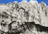
As a supplement to our discussion of texture, I'd like to direct your attention toward a painting/drawing technique that was perfected by the Surrealists, called decalcomania:


"..a perfected form of a well-known children’s game, the ‘blotting’ game. Here the method was to pour diluted black gouache on to a sheet of white paper of a certain texture, covering this with another sheet and then execising uneven pressure with the hands, in order to spread the gouache. The result, always unpredictable, is a highly contrasted composition in black, grey and white, in which one can discover landscapes, profiles or heads, composite animals, [or] unknown plant life. […]Max Ernst conceived the idea of trying the experiment directly on a canvas, with oil paint reduced to a suitably fluid state. What began as a mere game suddenly seemed to him to offer rich possibilities…" (Patrick Waldberg)

I've included some examples below of how this technique was used by the master of the technique, Surrealist Oscar Dominguez, for you to consider the possibilities of organic texture: